Wythenshawe Community Housing Group
A joined-up digital experience for residents who need it most
Services
- UX Discovery and Research
- Information Architecture
- Accessibility-First Design
- Website Design and Build
- App and Portal Design and Build
The challenge
Wythenshawe Community Housing Group’s existing website, app and portal weren’t working hard enough for their residents. Tenants were defaulting to phone contact for tasks that could easily be handled online, partly because the digital experience wasn’t clear or trustworthy enough to encourage self-service.
Navigation was complex, pages were content-heavy, and the platforms didn’t reflect the diversity of WCHG’s resident base or the range of services they needed to access.
WCHG challenged Trunk to replace their outdated platforms with a joined-up digital service, one that would reduce pressure on frontline teams, give residents genuine self-service capability, and work for everyone in their community, including older tenants and those less confident online.
The approach
Research before anything else
Rather than rely on assumptions, we invested in understanding the problem properly. We conducted focus groups and usability studies with residents, built detailed personas grounded in evidence, and analysed GA4 and call-volume data together to identify where journeys were breaking down and where phone demand was highest.
The picture was consistent: residents wanted to manage their tenancy digitally, but the experience needed to earn their trust before they would.
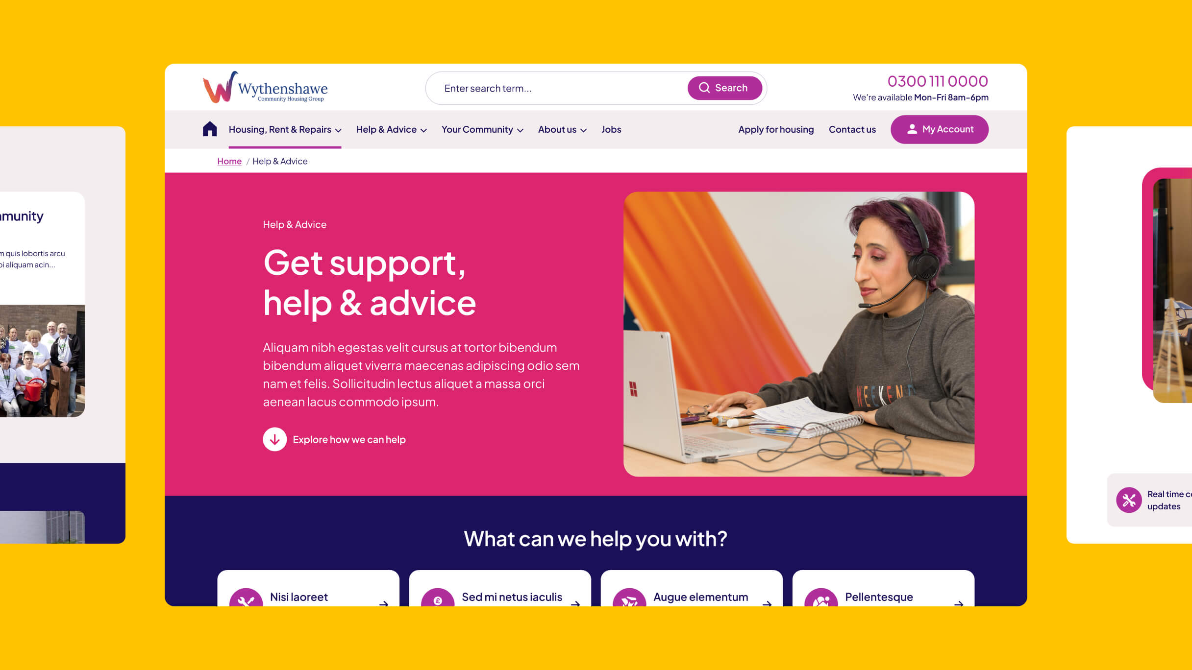
Designing around real tasks
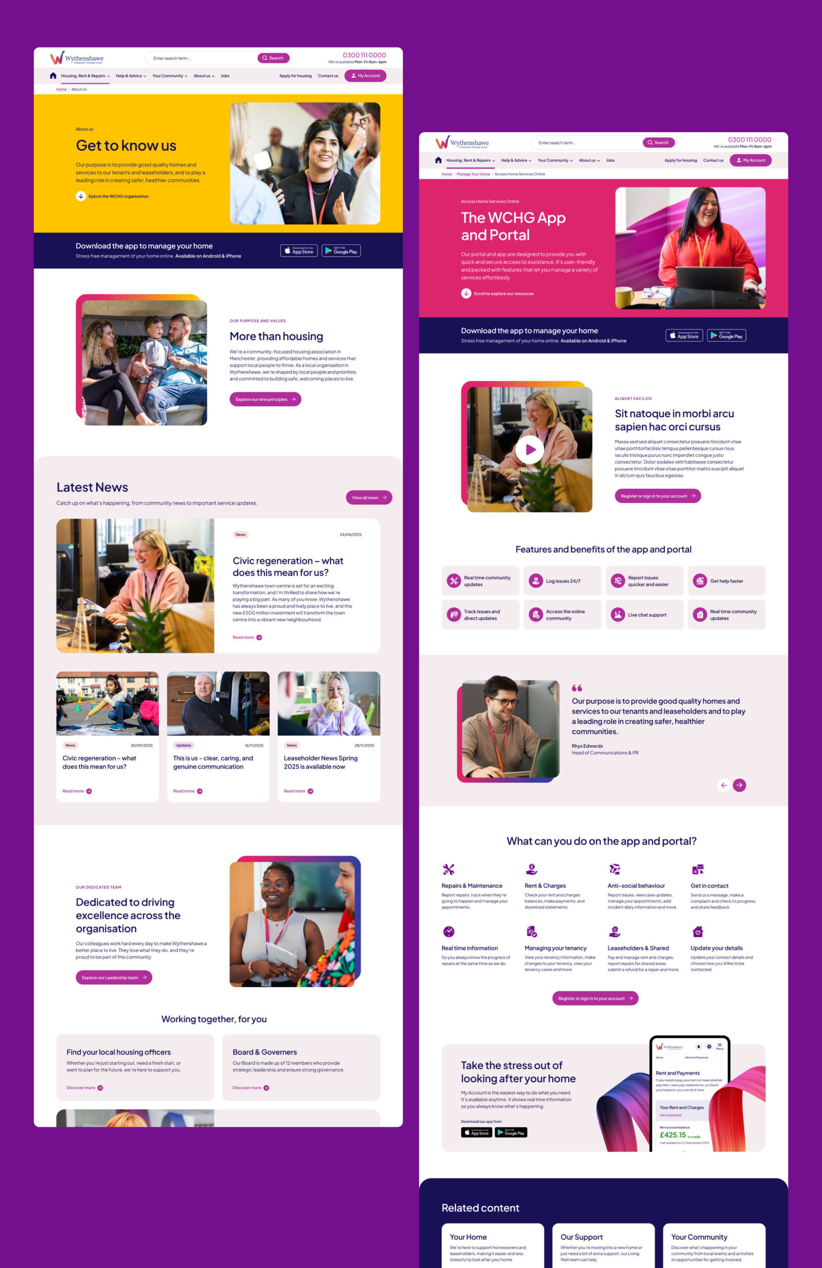
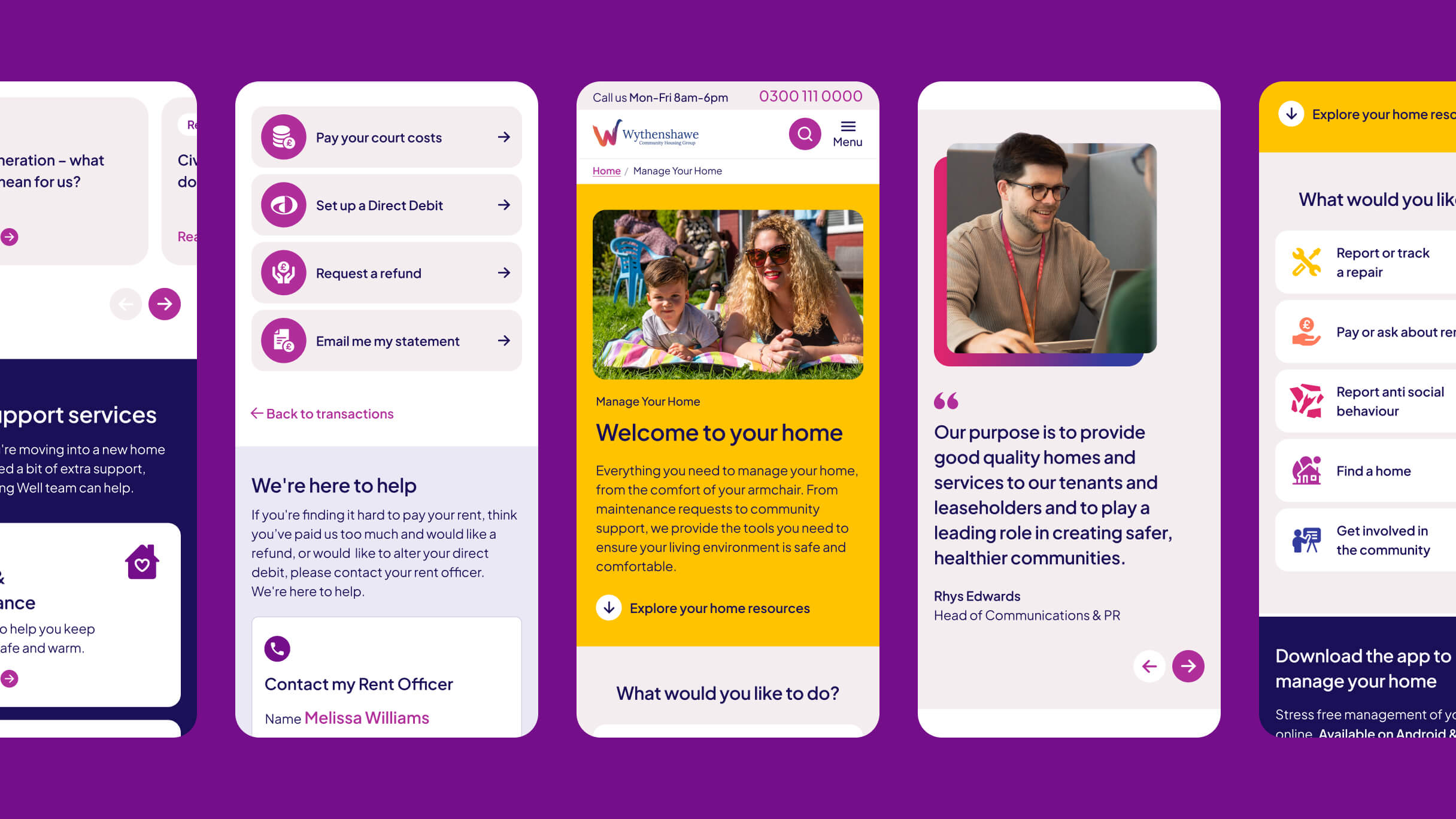
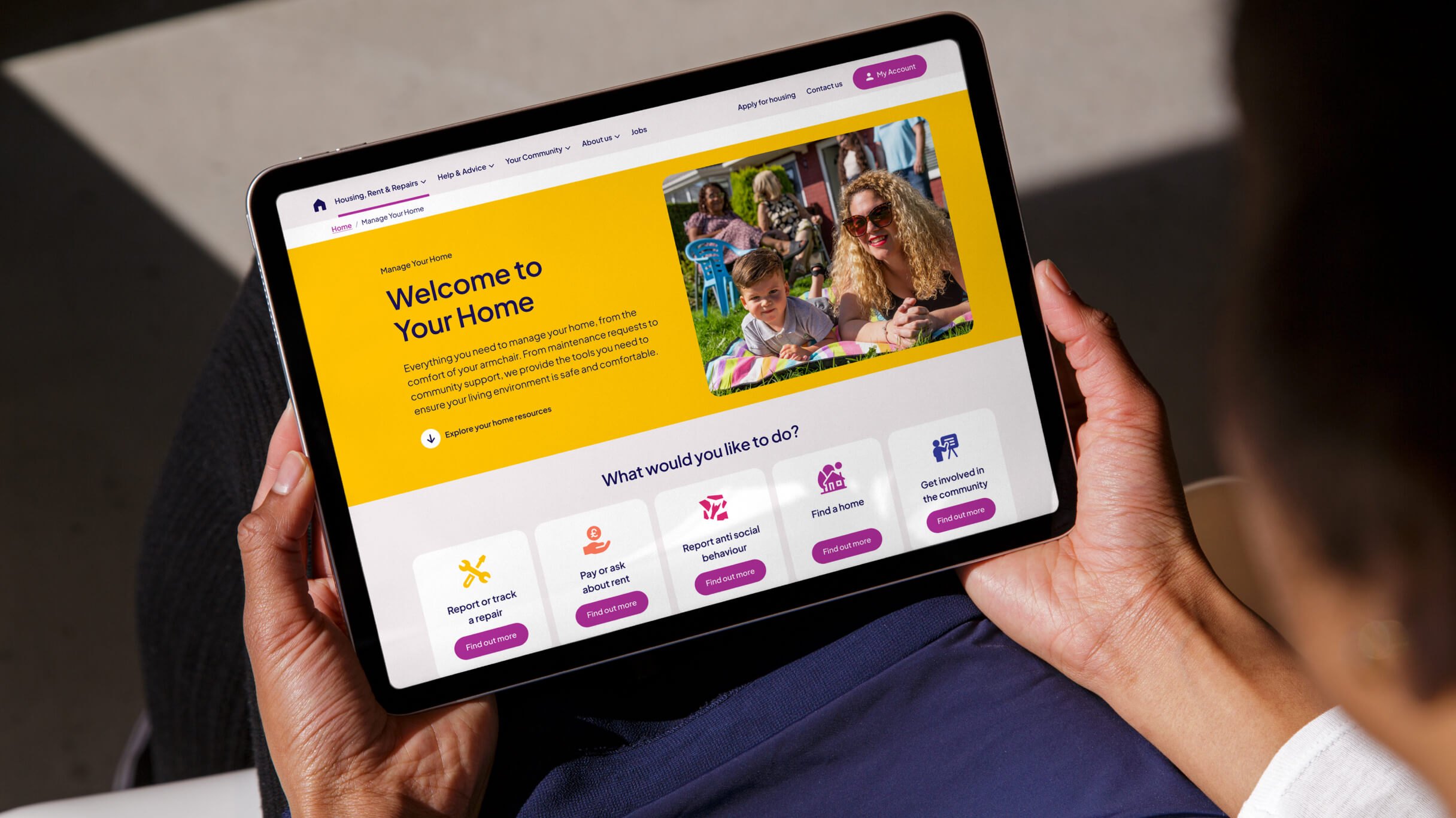
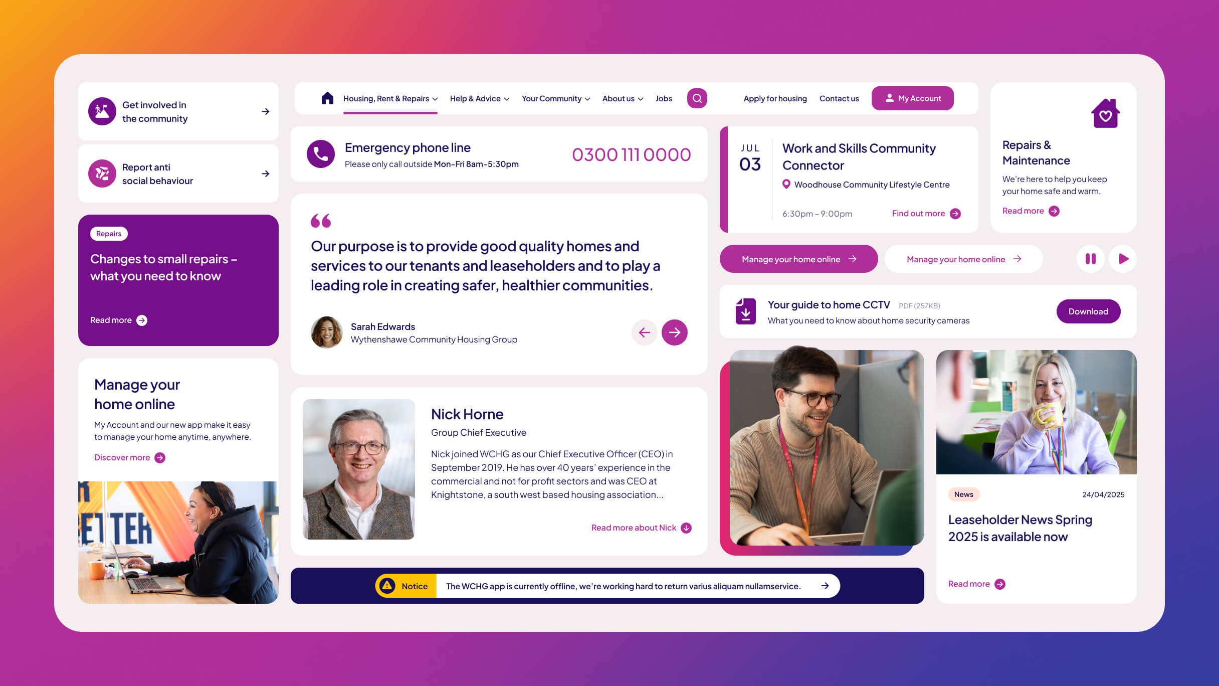
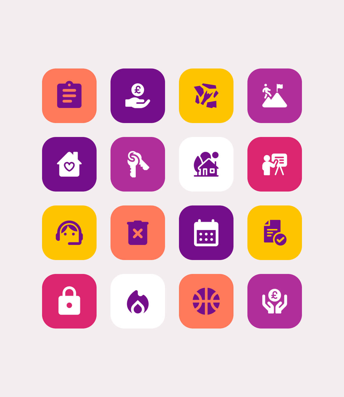
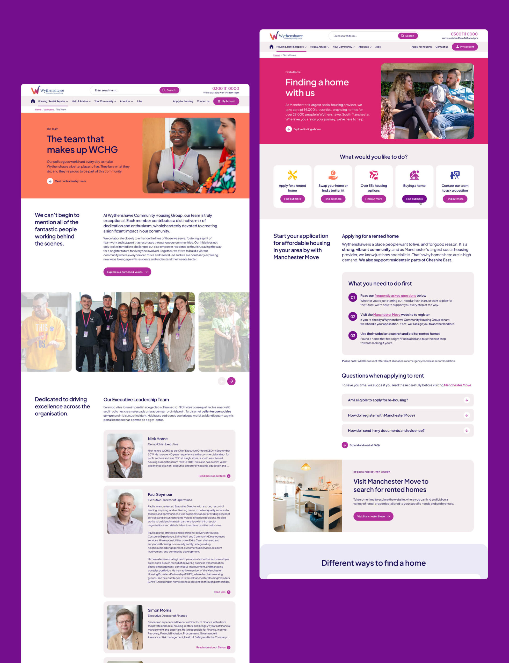
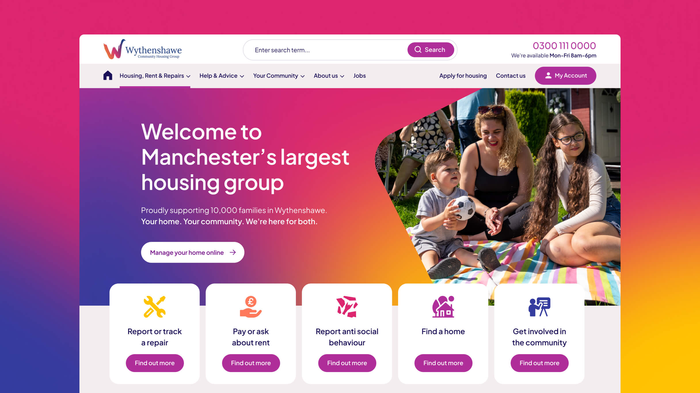
Using those insights, we developed a new information architecture for the website, app and portal, structured around the tasks residents actually need to complete: reporting repairs, managing rent, accessing community support, finding safeguarding information.
Over 14,000 web pages were reduced to 52 clear, task-focused pages. An intuitive search function helps residents find services quickly, while real-time Salesforce integration means the information they see is always accurate and up to date.
Inclusion by design
Particular care was taken for residents most at risk of digital exclusion. Assistive technology, plain English content, reading-age guidelines and a quick exit function were built in from the start, not added later. We designed for the most vulnerable residents first, knowing that if the experience worked for them it would work for everyone.
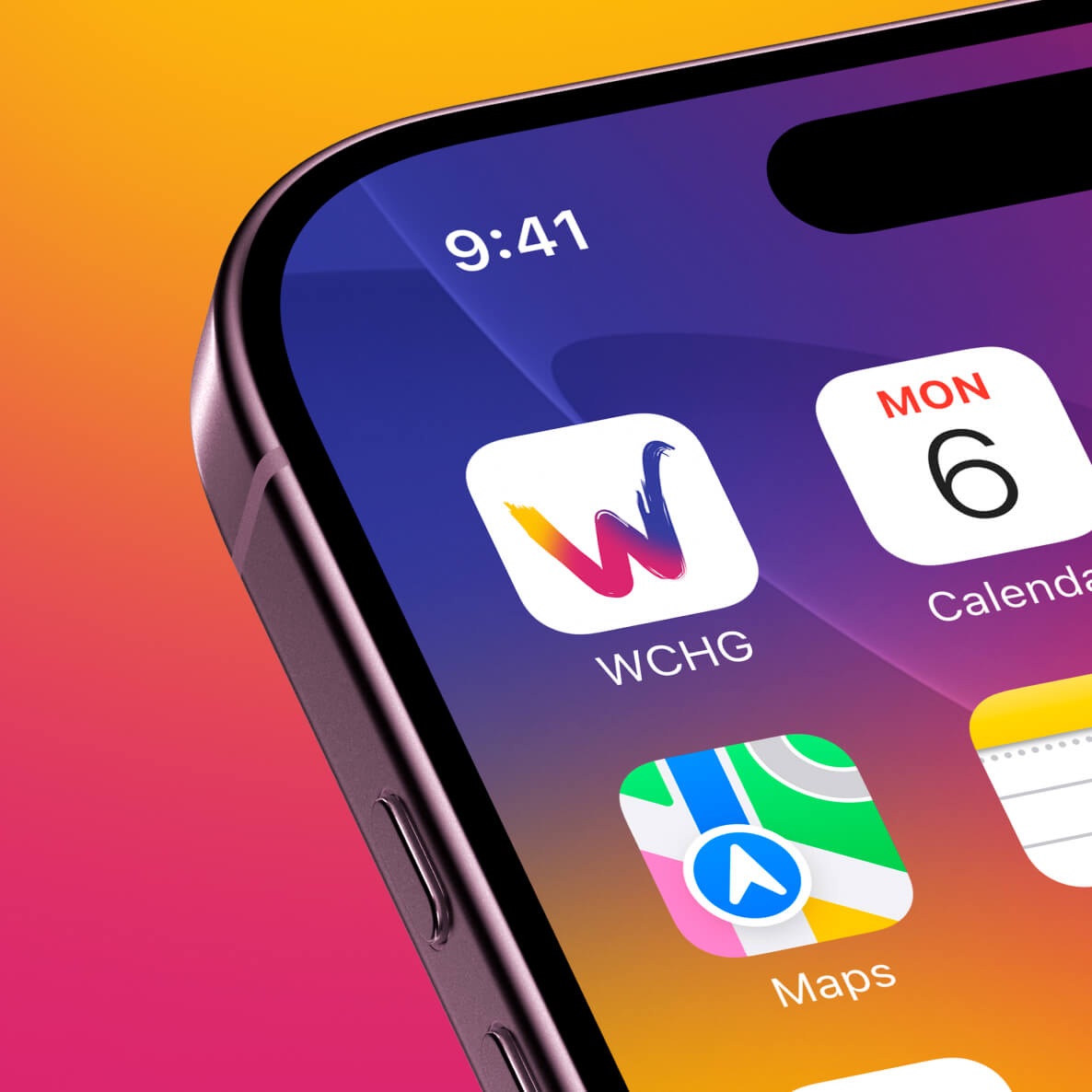
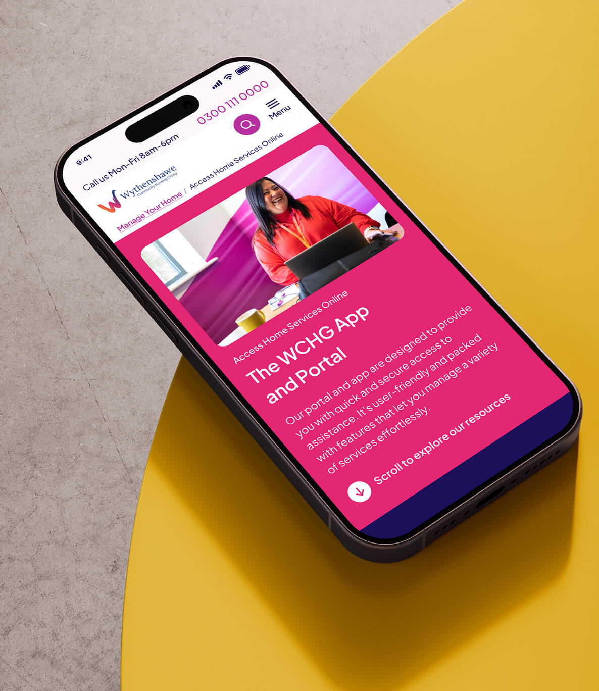
Three platforms, one coherent experience
The website, app and portal were delivered in parallel, consistent in brand, experience and how the systems connect. Residents can now report repairs, manage payments, upload documents and update personal details within a single secure journey, without needing to call.
From the first discovery sessions through to launch, Trunk's process was thorough, well-structured and collaborative. They took the time to understand our residents and our organisation, and that showed in the quality of what they delivered.
Rhys Edwards - Head of Communications & PR
The results
The platforms launched to strong early adoption, with over 1,300 residents signing up in the first week.
Website engagement rates have risen from 44% to 68%, with average session duration more than doubling from 2 minutes 19 seconds to nearly 5 minutes. The native app is achieving an engagement rate of 89%, with residents averaging nearly nine screen views per session. Repairs and payments are the most used features across both the app and portal.
Most importantly, residents are responding to an experience that was built around them.
“I don’t need to ring anymore. I can just do it myself and it makes sense.” – WCHG Resident